Designing the invite
Wedding invitations are still very much a tradition, and given my modest experience in designing various artifacts over the years, I didn't want to hand this off to someone else. So, I decided to take matters into my own hands. Partly because when I asked around, most local shops only offered pre-made templates and wouldn’t do custom designs. And partly because I had recently purchased Affinity Designer, and this seemed like the perfect excuse to finally give it a go. I hadn’t used Adobe Photoshop in a while (no license, and don’t get me started on their latest AI-related changes in terms).
Now, while Photoshop and Affinity Designer share a similar workflow for most of the basic stuff, moving beyond the basics was really trying. After a fair amount of trial and error, I started to get the hang of things. Things slowly started to click, and I no longer felt like throwing my computer out the window every five minutes.
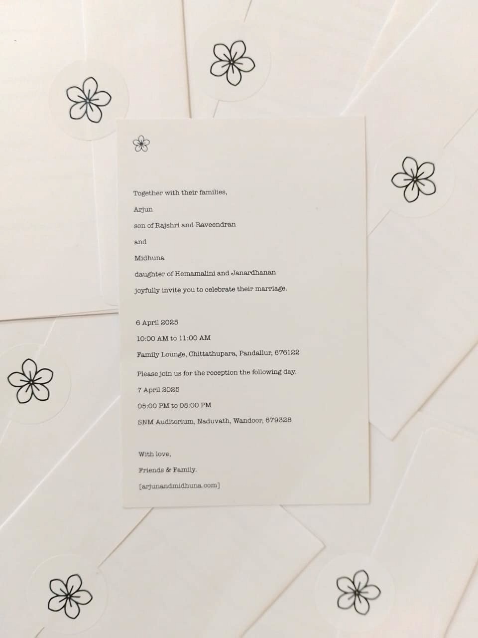
As for the design, my goal was simple: keep it simple and clean. I remember showing a friend an H&M price tag and saying, “I want it to look like this.” It definitely had a bland, corporate feel. But what I was really after was its simplicity. It was minimal, but practical. So, I set out to design the card. Initially, I went with a wide layout, but when I kept all the fonts the same size, it was, well, a bit boring (after all, what had I expected, designing after a price tag?). So, I made some changes. I enlarged our names, and that's how the initial version was born. I showed it to my mom. “This needs more information,” she said. Also, it didn’t have their names in it. So, I had to redo it. Back to my desk.
This time, I decided to go with a taller layout, and that was a much better choice. It gave me enough room to fit in all the content, while still leaving some breathing space. But when I finished adding the content, I couldn’t help but think it still looked kind of bland.
So, I decided to experiment a bit. I changed up the fonts, and to make it look more interesting, I decided to add a little symbol at the top. But honestly, I didn’t have the time or energy to design a custom symbol myself, and I was still somewhat struggling with the software, so I went searching online. I found one on Freepik that worked perfectly. I liked it so much, I ended up using it everywhere. Even on the envelope seals and website. It was basically everywhere by the end. At last, after some final adjustments, the invitation was ready to print. I went with Vistaprint, as I’d used them before. They were quick, reliable, and the pricing was somewhat decent. A week later, the invitations arrived, and while the printing wasn’t perfect (they messed up the bleed a little), they still looked pretty good. Here's the final result: